
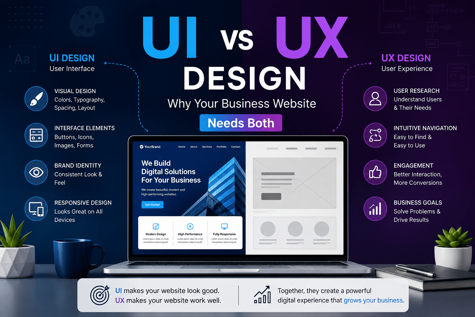
Ask ten business owners what “UI/UX” means and you’ll likely get ten different answers — most of them some version of “making the website look nice.” That’s not wrong, exactly, but it’s incomplete in a way that costs businesses real money. UI and UX are two distinct disciplines that work together to determine whether a visitor to your website actually becomes a customer, or quietly leaves and never comes back.
This article breaks down exactly what UI design is, what UX design is, how they differ, how they overlap, and — most importantly — why a business website that only invests in one of the two is leaving conversions, trust, and revenue on the table.
The Quick Answer
UI (User Interface) design is about the look and feel of the individual elements a user interacts with — buttons, menus, forms, icons, colors, and layout. It’s the visual skin of your website.
UX (User Experience) design is about the overall journey a user takes through your website — how easy it is to find information, complete a purchase, or get an answer to a question. It’s the underlying logic and flow.
A simple way to remember it: UI is what you see. UX is what you feel while using it.
You can have a beautiful interface that’s frustrating to use (great UI, poor UX). You can also have a perfectly logical, easy-to-navigate site that looks amateurish and fails to build trust (great UX, poor UI). Neither scenario serves your business well. This article explains why — and what “both, done well” actually looks like.
What Is UI Design, Exactly?
UI design is the discipline of designing the visual and interactive elements of a digital product — every button, icon, menu, color, font, and piece of visual feedback a user encounters. If your website were a car, UI design would be the dashboard: the steering wheel, the buttons, the display screens, the way everything is laid out within arm’s reach.
Core responsibilities of a UI designer
Visual consistency. A UI designer ensures that buttons look and behave the same way across every page, that headings follow a consistent size hierarchy, and that spacing and alignment feel intentional rather than accidental. This consistency is what makes a website feel professional and trustworthy rather than thrown together.
Color and typography systems. UI designers choose color palettes (and the psychological associations that come with them — blue for trust, red for urgency, green for growth) and typography systems that are both on-brand and genuinely readable across devices.
Component design. Buttons, dropdowns, form fields, navigation bars, cards, modals — these are the building blocks of any website interface. UI designers design each of these components in every state they might appear in: default, hover, active, disabled, error, and loading.
Responsive layout execution. While UX often decides the overall structure, UI design handles the specific visual execution of how that structure adapts across screen sizes — deciding, for instance, exactly how a three-column layout collapses into a single column on mobile, and how much padding surrounds each element at each breakpoint.
Micro-interactions and visual feedback. Small details — a button that subtly changes color on hover, a loading spinner, a satisfying checkmark animation when a form submits successfully — are UI design decisions. They seem minor individually, but collectively they’re a huge part of what makes a website feel polished versus clunky.
Design systems. For larger sites, UI designers often build a design system — a documented library of colors, fonts, spacing rules, and reusable components — so that the site stays visually consistent even as new pages and features are added over time.
Tools UI designers use
UI designers typically work in Figma, Adobe XD, or Sketch, building high-fidelity mockups that closely resemble the final product. They also often maintain style guides or design systems in these tools, and may use plugins for accessibility checking, color contrast validation, and asset export.
The mindset of a good UI designer
Good UI design requires a genuinely visual eye — an instinct for spacing, alignment, contrast, and hierarchy — combined with a good deal of restraint. Much of the skill in UI design is knowing what to leave out: which elements don’t need a border, which text doesn’t need to be bold, which page doesn’t need another banner. Cluttered interfaces are usually the result of too many individually reasonable decisions stacked without editing.
What Is UX Design, Exactly?
UX design is the discipline of designing the overall experience a user has while interacting with a product — the structure, flow, and logic that determines whether they can accomplish what they came to do, quickly and without frustration. If UI is the dashboard of a car, UX is the entire experience of the drive: how intuitive the controls are, whether the route makes sense, and whether you arrive at your destination feeling relaxed or stressed.
Core responsibilities of a UX designer
User research. Good UX design starts with understanding real users — their goals, frustrations, and behavior. This might involve interviews, surveys, analytics review, or usability testing on an existing site to identify where users get stuck.
Information architecture. UX designers decide how content and features are organized — what goes in the main navigation, how deep a user has to click to find a specific product or piece of information, and how different sections of the site relate to one another logically.
User flows and journey mapping. A UX designer maps out the specific steps a user takes to complete a goal — for example, the exact sequence of screens and decisions involved in adding a product to a cart, entering shipping details, and completing checkout. Every unnecessary step in that flow is a potential drop-off point.
Wireframing. Before any visual design happens, UX designers typically create wireframes — bare-bones, low-fidelity layouts that show where content and functionality will live on a page, without worrying about colors, fonts, or final visual polish. This lets teams validate structure and flow before investing in detailed visual design.
Usability testing. UX designers test designs (often at the wireframe or prototype stage, but also after launch) by watching real users attempt real tasks. This surfaces confusion and friction that internal teams, too close to the product, often miss entirely.
Accessibility strategy. Making a site usable for people with visual, auditory, motor, or cognitive impairments is fundamentally a UX concern — it affects navigation logic, content structure, and interaction design, not just visual contrast.
Conversion optimization. For business websites specifically, UX design is directly tied to business outcomes: reducing form abandonment, streamlining checkout, and making calls-to-action obvious and compelling within a logical flow.
Tools UX designers use
UX designers use many of the same visual tools as UI designers (Figma, Adobe XD) but often for lower-fidelity work — wireframes and flow diagrams rather than final visuals. They also rely on tools like Miro or FigJam for journey mapping and brainstorming, analytics platforms like Google Analytics or Hotjar for behavioral data and heatmaps, and user testing platforms to gather direct feedback from real users.
The mindset of a good UX designer
UX design rewards a research-oriented, almost investigative mindset. A good UX designer is constantly asking “why” — why does a user abandon this form, why do they hesitate before clicking this button, why does this page get high traffic but low conversions. It’s a discipline built on empathy and evidence rather than personal taste; a UX designer’s job isn’t to design what they personally find appealing, but what actually helps real users accomplish their goals with the least friction.
UI vs UX: A Side-by-Side Comparison
| Aspect | UI Design | UX Design |
|---|---|---|
| Primary focus | Visual and interactive elements | Overall structure, flow, and logic |
| Core question | “How should this look and respond?” | “How should this work and feel?” |
| Output | High-fidelity mockups, style guides, component libraries | Wireframes, user flows, journey maps, research findings |
| Scope | Individual screens and components | Entire user journey across the product |
| Success measured by | Visual consistency, polish, brand alignment | Task completion rate, conversion rate, ease of use |
| Core skills | Visual design, color theory, typography, animation | Research, information architecture, psychology, analytics |
| Analogy | The interior design of a house — paint, furniture, fixtures | The architecture of a house — room layout, traffic flow |
| Comes first in workflow | Usually after UX (wireframes get visually designed) | Usually before UI (structure before styling) |
Why the Sequence Matters: UX First, Then UI
One of the most common — and costly — mistakes in website projects is designing the visuals before the structure is validated. It’s tempting to jump straight to picking colors and fonts because that’s the fun, tangible part. But if the underlying flow is confusing — if users can’t find the pricing page, or the checkout process has too many steps, or the navigation buries your most important service three clicks deep — no amount of beautiful visual design will fix that.
This is why professional design workflows almost always follow UX-then-UI sequencing:
- Research — understand who’s using the site and what they need to accomplish.
- Information architecture — decide what content exists and how it’s organized.
- Wireframes — lay out the structure of each page without visual styling.
- User testing on wireframes — validate the flow before investing in visuals.
- UI design — apply color, typography, imagery, and polish to the validated structure.
- Prototyping and further testing — test the fully styled experience for both usability and visual clarity.
Skipping straight to step 5 without steps 1 through 4 is like decorating a house before you’ve confirmed the floor plan actually works — you might end up repainting a wall you’re about to knock down.
Real-World Analogies to Cement the Difference
A restaurant. UX is the overall dining experience — how easy it is to get a table, how clear the menu is, how quickly food arrives, whether the layout lets you move to the restroom without squeezing past six tables. UI is the plating, the menu’s typography and design, the lighting fixtures, the chair upholstery. A restaurant with gorgeous plating but a two-hour wait and a confusing menu will still get bad reviews. A restaurant with fast, clear service but ugly plating will get better reviews than you’d expect, but still underperforms its potential.
A physical store. UX is the store layout — whether products are organized logically, whether the checkout line is easy to find, whether you can locate what you need without asking an employee. UI is the shelf design, signage, lighting, and product packaging. Ever been in a big-box store where the aisles are logically numbered and clearly marked (good UX) but the signage is faded and the shelves look cluttered (poor UI)? Or a beautifully designed boutique (good UI) where you can’t figure out where the fitting rooms are (poor UX)? Both experiences leave something to be desired.
An airport. UX is the layout: how signage leads you from check-in to security to your gate, how clearly connecting flights are indicated, how logically baggage claim is positioned relative to exits. UI is the visual design of that signage, the screens showing flight information, the self-check-in kiosks’ button layout. A confusing airport layout with beautiful signage still gets you lost; clear wayfinding with ugly, hard-to-read signage still gets you to your gate, just less pleasantly.
Why Your Business Website Needs Both
It’s tempting for a business with a limited budget to prioritize one over the other — usually UI, because visual polish is what’s immediately visible and easiest to evaluate at a glance. But focusing on UI alone while neglecting UX (or vice versa) tends to produce specific, predictable problems.
The cost of good UI without good UX
A visually stunning website with poor UX often shows the following symptoms: high traffic but low conversion rates, visitors bouncing quickly despite an attractive homepage, confused customer support inquiries about things that should be self-explanatory (“where do I actually enter my shipping address?”), and abandoned carts or forms at unexpectedly high rates. The site looks like it should be performing well, which makes the underlying problem harder to diagnose — everyone assumes the visuals are fine, so they don’t think to question the underlying flow.
The cost of good UX without good UI
A logically structured, easy-to-navigate website with poor UI often struggles differently: visitors complete tasks but don’t perceive the business as credible or professional, conversion rates on higher-consideration purchases (where trust matters more) lag behind expectations, and the brand feels generic or dated compared to competitors — even if functionally the site works fine. In competitive industries, visual polish is often doing more trust-building work than businesses realize; a clunky-looking interface can make even a legitimate, well-run business look unprofessional or even untrustworthy at a glance.
The compounding effect of getting both right
When UX and UI are both done well, they reinforce each other. A logically structured checkout flow (UX) that’s also visually clear about which step you’re on and what’s required next (UI) reduces abandonment far more than either improvement alone would. A well-organized product catalog (UX) presented with clean, consistent product cards and clear pricing (UI) builds both usability and trust simultaneously. This is why the strongest business websites treat UI and UX as a single, integrated design process rather than two separate checkboxes.
Common Misconceptions Worth Clearing Up
“UI and UX are basically the same thing.” They’re related but distinct disciplines with different outputs, different core questions, and — at larger companies — often entirely separate job titles and teams.
“UX is just wireframes, and UI is just colors.” This oversimplifies both. UX includes research, testing, and ongoing optimization based on real user behavior — it doesn’t stop once wireframes are approved. UI includes systems thinking around consistency, accessibility (color contrast, font sizing), and detailed interaction states — it’s not just picking a palette.
“A pretty website automatically means good UX.” Visual appeal and usability are genuinely independent variables. Plenty of visually striking websites test poorly in usability studies because navigation is unclear or key actions are buried.
“Small businesses don’t need to worry about UX, just UI.” This misconception is especially costly. A small business website often has fewer, higher-stakes conversion points (a single contact form, a single pricing page, a single “Book Now” button) — meaning UX friction at any one of those points has an outsized impact on overall business results compared to a large e-commerce site with many alternate paths to conversion.
“UX designers don’t need any visual sense, and UI designers don’t need to understand user behavior.” In practice, the best professionals in each discipline have meaningful literacy in the other. A UX designer with zero visual sense struggles to communicate flow ideas clearly to stakeholders; a UI designer with no understanding of user psychology tends to over-decorate interfaces in ways that actually hurt usability.
How to Evaluate Your Own Business Website
If you’re trying to figure out whether your current website has UI problems, UX problems, or both, here are practical diagnostic questions for each.
UX diagnostic questions:
- Can a first-time visitor find your core offering and pricing within 10 seconds of landing on your homepage?
- How many clicks does it take to go from homepage to completing your primary goal (purchase, booking, contact form)?
- Do your forms ask for more information than is strictly necessary at that stage?
- Have you ever watched a real person (not a colleague) try to use your site for the first time?
- Do your analytics show a specific page or step where visitors consistently drop off?
UI diagnostic questions:
- Do buttons and links look clickable, and do they look the same way across every page?
- Is there a consistent visual hierarchy — do the most important elements (headlines, CTAs) actually stand out visually?
- Does your site look current, or does the styling feel dated compared to competitors in your industry?
- Is text readable — sufficient contrast, sensible font sizes, comfortable line spacing — on both desktop and mobile?
- Do interactive elements give clear visual feedback (hover states, loading indicators, success/error messages)?
If you’re answering “no” or “not sure” to several questions in either category, that’s a strong signal about where your website investment should go first.
What This Means for Hiring and Budgeting
When commissioning website work, it’s worth being explicit with your agency or freelancer about whether UX work — research, wireframing, flow planning — is included, or whether you’re only paying for visual design. Many smaller projects skip formal UX work entirely and jump straight to visual mockups, which keeps costs down but increases the risk of structural problems that are expensive to fix after launch.
For most small-to-medium business websites, a reasonable middle ground is: light UX work upfront (a clear sitemap, wireframes for key pages like the homepage and any conversion-critical pages such as checkout or booking) followed by thorough UI design applied to that validated structure. This doesn’t require the full research apparatus of a large enterprise UX team, but it does mean structure gets thought through deliberately rather than being an afterthought to visual design.
It’s also worth asking whether post-launch UX work — reviewing analytics, running basic usability checks, iterating based on real user behavior — is part of an ongoing relationship with your web team, or a one-time effort that ends at launch. Websites aren’t static; user behavior and business goals change, and the best-performing sites tend to be the ones that get revisited and refined based on actual usage data rather than left untouched for years after launch.
Conclusion
UI and UX design are often bundled together in conversation, but they answer fundamentally different questions. UX design asks whether your website’s structure and flow actually help visitors accomplish what they came to do, with minimal friction and confusion. UI design asks whether the visual execution of that structure is polished, consistent, and trustworthy enough to keep them engaged along the way.
A business website that only invests in one half of this equation will always be leaving something on the table — either a beautiful site that quietly frustrates and loses visitors, or a functional site that fails to build the visual trust needed to convert. The businesses that get the most out of their website investment are the ones that treat UX and UI not as competing priorities, but as two halves of a single, deliberate design process — structure first, polish second, and both grounded in a real understanding of the people actually using the site.