Responsive Email Design
Responsive email design is key for modern marketing, ensuring your emails look professional on any device. At Bala Infotech, we craft responsive email designs tailored to engage your audience across various screens. Whether it’s mobile, tablet, or desktop, our designs adapt seamlessly, boosting click-through rates and driving user engagement.
Creating Effective Responsive Email Design
Responsive email design is crucial for businesses targeting diverse audiences on different devices. Bala Infotech specializes in building email designs that adjust effortlessly, providing a consistent user experience. With responsive email design, your audience can interact with your content comfortably on any screen size, from smartphones to large desktop monitors.
We focus on three essential elements to enhance effectiveness: mobile optimization, eye-catching visuals, and clear calls to action. Mobile-friendly layouts are non-negotiable in today’s landscape, as the majority of emails are opened on mobile devices. Our team ensures that the visuals are not only appealing but optimized to load quickly without compromising quality. Finally, our CTAs are strategically placed to drive action without overwhelming the recipient, making every email a seamless and engaging experience.
Ready to Make Your Vision a Reality?
Are you ready to turn your ideas into reality? At Bala Infotech, we’re passionate about helping you achieve real, measurable success. Whether you’re an ambitious entrepreneur, an innovative thinker, or someone driven by passion, we’re here to support you every step of the way.
Our dedicated team is committed to transforming your vision into extraordinary results. We believe in the power of collaboration and innovation, ensuring your goals are at the forefront of our efforts. Together, we can embark on a journey to create something truly remarkable.
With our expertise combined with your vision, the possibilities are endless. Don’t hesitate—let’s connect and start building something amazing today!
Get in Touch with Us!
Why Bala Infotech’s Responsive Email Design Stands Out
Our responsive email design service at Bala Infotech goes beyond standard email templates, integrating unique elements tailored to each client’s needs. We combine market insights with advanced tools to ensure emails look and function beautifully on every device. Every design aligns with your brand identity and objectives, reinforcing your company’s values and message.
With expertise in HTML and CSS for email, our team creates layouts that adapt automatically based on the user’s device. Our designs are rigorously tested across multiple platforms, ensuring compatibility with various email clients. Furthermore, we understand the importance of delivering value with every email, focusing on usability, readability, and interactivity. Bala Infotech’s approach enhances engagement rates, conversions, and brand loyalty by providing a seamless experience that resonates with your audience.
Key Features of Our Email Design
Cross-Device Compatibility
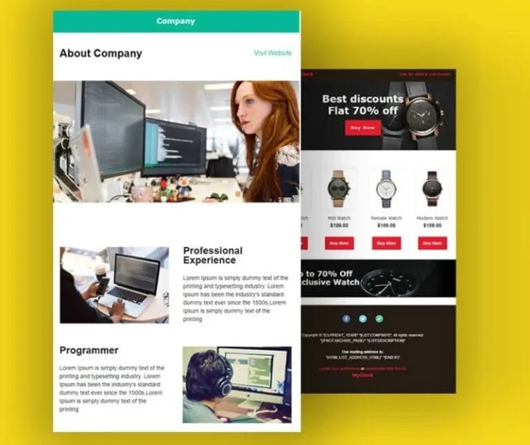
Each email adapts effortlessly to different screen sizes, ensuring readability and aesthetics across all devices, and enhancing user engagement.
Fast Loading Times
Optimized visuals and lightweight code reduce loading times, allowing recipients to access content swiftly, especially on mobile devices.
Customizable Designs
Tailored designs align with your brand’s identity, adding uniqueness to each email and enhancing brand recognition.
Action-Oriented Layouts
Clear calls-to-action are strategically placed to guide users, maximizing click-through rates and achieving campaign objectives.
Compatibility with Major Email Clients
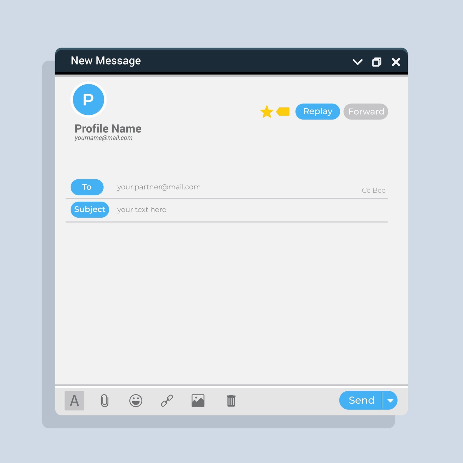
Rigorous testing ensures smooth functionality across popular email clients like Gmail, Outlook, and Apple Mail.
Analytics and Tracking Integration
Built-in analytics provide insights on open rates and click-through metrics, helping you refine your email marketing strategy.
What Our Clients Say
You Can See Our Clients Feedback What You Say?
Frequently Asked Questions
We hope these questions and answers help you find the best digital transformation partner for your business.
Responsive email design ensures that an email adjusts to different screen sizes, providing a consistent experience on all devices.
It improves user engagement by ensuring your emails look professional and are easily readable on any device.
Yes, we rigorously test each email across multiple devices and email clients to ensure compatibility.
Absolutely! We tailor designs to align with your brand identity and goals.
By making emails more accessible and visually appealing across devices, responsive email design enhances engagement rates.
Yes, our designs are optimized for fast loading on mobile, enhancing the user experience.
We ensure compatibility with all major email clients, including Gmail, Outlook, and Apple Mail.
Yes, we integrate analytics for insights into open rates, click-through rates, and more.
No, it ensures your emails look great on all screen sizes, from desktops to smartphones.
All industries benefit, as responsive design ensures professionalism and accessibility for diverse audiences.